navigation + ia project
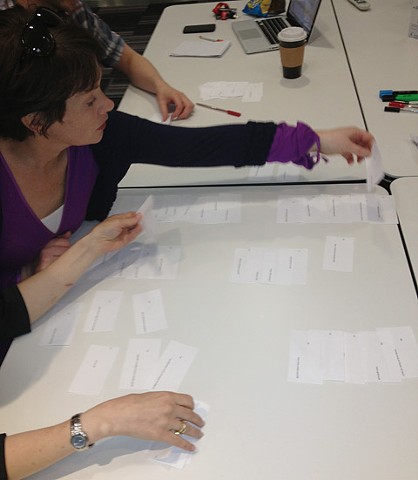
to gain insights into how others would organise Vodafone.ie, we held:
- a closed card sort workshop with internal stakeholders
- an open card sort with a large number of anonymous users (via OptimalSort)
we already knew from numerous other research projects that there was a nearly even split among shoppers looking for information on devices first, and those looking for information on pricing and plans first, but the rest was pretty wide open. we weren’t surprised when ‘phones’ and ‘costs’ groupings came together easily, but the variation that emerged in groupings such as ‘help & support’ stretched our expertise to define a solution.
this research, along with advice from vodafone group and a competitor analysis, informed decisions to:
- remove the top level ‘category’ pages based on navigation titles
- the amalgamation of sections and pages where content was broadly similar
- the removal of a number of low-performing pages
- updating the language to more customer-friendly terms
