navigation + ia project
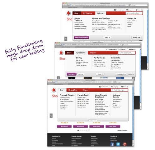
to confirm that we were interpreting the card sort data accurately, i developed a clickable html prototype to test with users in a lab setting. by rating how easy it was for users to navigate to key pages, we were able to discern what sections of the navigation were working and which needed additional attention.
along with new feedback from stakeholders, a few iterations later we were happy that we’d developed a new mega drop down that would allow the business to guide users through the journeys that we wanted them to take, while allowing users to easily find the information they needed.
